Designer Tip
When creating ads, I try to make it as easy as possible for viewers to see how to get what’s in the ad. If it’s a new release, I link the ad directly to that product in my store, not my whole store. If it’s a blog post, the link goes to the specific blog post and not the main address of my blog. I know it’s tempting to bring people to your whole storefront or the top of your blog with the idea that they will see something else they want and buy that too. I prefer not to market that way because I don’t like to shop that way and I think I’m not in the minority. It makes me a little crazy when I go into a brick & mortar store to pick up something in the ad and I can’t find it. It does not make me wander around the store looking for something else to buy!However, if I have a good shopping experience with that ad item maybe then I will stick around and see what else is available. I think that not getting readers to straight to the product they’re interested in can cause you to lose sales instead of increase them. I think it’s better to make it easy for them to put that first thing in their cart and let me decide if they’re still in a shopping mood! Perhaps more sales for you and definitely a nicer customer experience!
Designer Call
CUDigitals is growing! Are you creating high-quality, unique designer tools and want to showcase them in an active, growing store? I am currently looking for new designs! Check out all the details HERE.NEW RELEASES at CUDigitals.com











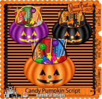
Check it out!
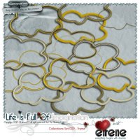
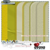
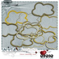
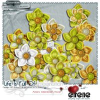
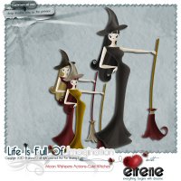
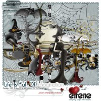
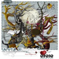
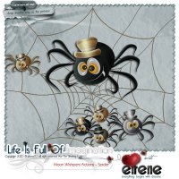
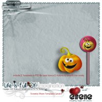
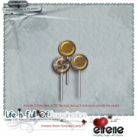
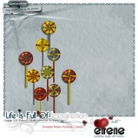
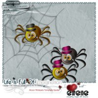
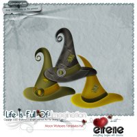
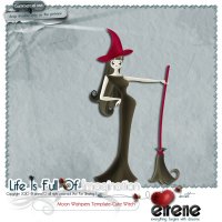
Eirene now has some of her new items available as Actions AND layered Photoshop templates. If you can’t run actions, you now have the option of buying the templates for her wonderful designs! See all her products out HERE.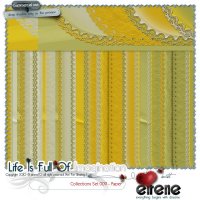




























Have a great weekend!
Christine Smith || Owner

No comments:
Post a Comment
Note: Only a member of this blog may post a comment.