Today you can learn a quick and easy method to make altered photo frames in Photoshop using purchased CU frames and a “paper sandwich”. Adding a coordinated frame into your kits is a great way to really make your designs unique and marketable!
Start by opening a finished paper for your kit (flattened/.jpg) and then drag the frame you want to use onto your canvas one layer above the paper.

In this example, I am using the paper I made for the easy distressed paper tutorial HERE. The frame is from Frame Me 4 by Manu Scraps

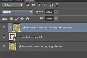
Next, make the paper sandwich – just add another copy of the paper on the layer above the frame and then clip it to the frame layer.
You can do this in the menus with layer > create clipping mask
or keyboard combo CTRL + ALT + G
OR ALT + click on the line between the layers in the layer palette

(In your work area you will not be able to see the frame anymore but we will adjust that in the next step.)
Now for the magic and fun. The first step is to change the blend mode of the top paper layer. I started with multiply

This can be set in the layers palette just above the layer thumbnails

Now it’s time to do some Photoshop magic. The reason for the paper sandwich is so that as you are making adjustments on the frame or top paper, you can see how to colors and saturation match the original paper. This way, you don’t get a frame that is altered with the patterned paper and matching your theme but off on colors.
To get a good match, you have a ton of options and I find it is just a matter of playing with different options – primarily the blend mode of the paper plus adjustments to the frame. I usually start with curves, saturation and exposure on the frame. I always work with adjustment layers rather than making a change to the layer itself. That way, the change is non-destructive – it can be adjusted more.
IMPORTANT: Make sure you clip the adjustment layers to the frame or it will also affect the bottom paper layer too and you will not be able to see the original paper colors and lightness

This is my final result on the above frame and paper.
I used Overlay blend mode on the paper. I added a curves adjustment (pulling the curve UP in the right corner) and a hue/saturation adjustment (-80 saturation, +21 lightness). You can see that I have a good match on the frame with the original paper in terms of color and lightness.

To finish, simply turn off the visibility of the bottom layer. Don’t forget to trim empty pixels before saving as the final .png for your kit.

I hope you have fun playing with technique and discover lots of ways to use it for your digital scrapbook kit designs.
Be sure to check out the store at CUDigitals for a large selection of CU OK frames you could use as well as thousands of other Commercial Use digiscrap tools and supplies.


Did you find this useful? Subscribe to the CUDigitals weekly newsletter and never miss another tip, event or freebie! And be sure to follow us on Facebook for a CU freebie overlay set and extra links to helpful articles for your digital scrapbook design business.


I look so forward to your tips. I want to thank you for sharing with us. I love learning and it is designers like yourself that inspire me.
ReplyDeleteGreat tut, thank you!
ReplyDeleteI've totally been wondering how to do this with doilies - have them match papers but still keep their 3-D detailing and definition. Looking forward to trying this technique out. Thank you!
ReplyDelete